


JC Thumb Viewer - User manual
Overview | Properties | Methods | Events | XML | ActionScript 3.0 usage | User Manual
Table of contents
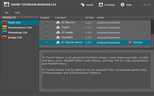
1. OverviewJCThumbViewerScroller is an Adobe Flash CS3/CS4 ActionScript 3.0 component created by JumpeyeComponents to provide an easy way for displaying scrolling thumbnail lists and navigating through them. Further more, the component supports FlashEff2 filters and button effects applied over the items in the list.JCThumbViewerScroller is part of a larger package, JCThumbViewer, which contains another similar component, JCThumbViewerDock, for displaying thumbnails in a page-like format. Both components can be easily set up using the JCThumbViewer Panel in a similar way to the FlashEff2 component. Note: JCThumbViewerDock is only working with Flash Player 10+ and Adobe Flash Professional CS4 and this is why it will not appear in the Components panel of Adobe Flash CS3. Note: For information on the properties, methods, events and the XML structure required to set up JCThumbViewerScroller, please consult the ActionScript 3.0 Usage document. Note: For best results make sure the itemWidth and itemHeight values match the actual thumbnail image width and height in pixels and use the "exactFit" scale mode. 2. CompatibilityActionScript: 3.0Flash IDE: Flash CS3, Flash CS4 FlashPlayer: FlashPlayer 9 + 3. Requirements1. JCThumbViewerScroller runs in Adobe Flash CS3 and CS4, AS3.0 only, on both Windows and Mac.2. A permanent Internet connection and a JumpeyeComponents.com account are required to run the JCThumbViewer Panel. 3. No coding skills are required (while using the JCThumbViewer Panel for configuring the component) unless you would like to use it in advanced/script mode; however, basic Flash CS3/CS4 knowledge is necessary. 4. Installation and UsageJCThumbViewerScroller consists of two parts: the Component itself and the components interface panel. The JCThumbViewerScroller Component (Window > Components) is the main part of the JCThumbViewerScroller system. It is the element that holds basic actions, and it controls and mediates between different objects and the FlashEff2 Patterns based upon the settings received from XML statements or directly from the JCThumbViewer Panel.The JCThumbViewer Panel (Window > Other Panels > JCThumbViewer Panel) is an online tool that loads within Flash CS3/CS4 itself (the Flash IDE). The JCThumbViewer Panel is the interface you use to set the source of the component and select, configure, and apply FlashEff2 effects on the items from the list. In other words, its the hands-on tool youll be using to create thumbnail lists. 4.1. InstallationInstallation requires Adobe Extension Manager Version 1.8 (Flash CS3) or Version 2+ (Flash CS3 and Flash CS4). Adobe Extension Manager is freely available for download on the Adobe website at: http://www.adobe.com/exchange/em_download/.Note: If you are installing a major update (i.e., you have been notified through the JCThumbViewer Panel), please see Section 4.2. 1. Download the JCThumbViewer package from your JumpeyeComponents.com account page. 2. Unzip/Unpack the files to a directory of your choice on your hard drive. 3. The .mxp installation file is located in the main directory of the unzipped files. 4. If you do not have Adobe Flash CS3 or CS4 opened, please open it. 5. Launch the Adobe Extension Manager from within the Adobe Flash IDE by selecting Help > Manage Extensions. If you have a prior version of JCThumbViewer, uninstall that extension. 
6. To install JCThumbViewer, open the .mxp file using Adobe Extension Manager (click on the Install button or select the File > Install Extension menu item) and follow the prompts to complete the installation process. 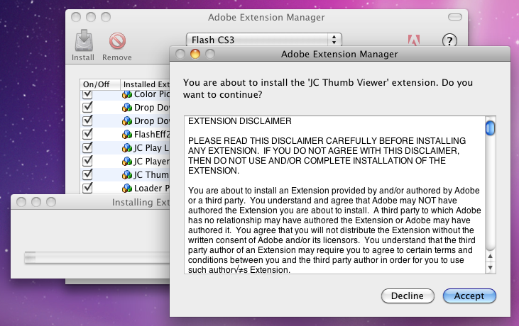
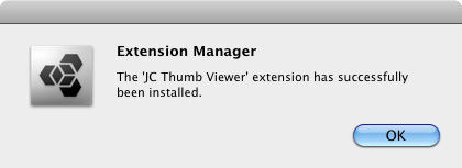
Once the components has been successfully installed, close Adobe Flash for the installation to take effect. Then, open Adobe Flash and you'll find the components in the JCThumbViewer folder of the Components Panel (Window > Components) and the JCThumbViewer Panel in the Window menu (Window > Other Panels > JCThumbViewer Panel). The Panel is what youll use to configure your thumbnail lists. 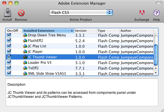
4.2. Installing a Major Update of JCThumbViewerWhen major updates of JCThumbViewer are released, the JCThumbViewer Panel will notify and prompt you to download the new version. The Download now button will take you to the Downloads List in your JumpeyeComponents.com account. From there, download the package again, save it to your disc, and unpack it in a destination folder of your choice as before.First, if you have Adobe Flash opened we recommend you to save all your opened files and then open Adobe Extension Manager exactly as specified in the installation steps described earlier. Then, select the older version of the JCThumbViewer Component and uninstall it (press the remove extension button or File > Remove extension). Next, follow the installation steps from paragraph 4.1. Finally, once installed, close the Adobe Extension Manager and also close and open Adobe Flash CS3/CS4 for the installation to take effect. With any file open on which you were previously working, select one of the JCThumbViewerScroller and/or JCThumbViewerDock Components instances and bring up the JCThumbViewer Panel. Select Menu > Update fla to update all the FlashEff2 Patterns and the JCThumbViewerScroller and/or JCThumbViewerDock Components from the library with the newly installed versions. Please be patient as this process may take several minutes, depending upon the complexity of your project. 4.3. Getting StartedThe JCThumbViewerScroller Component can be used to create scrolling lists of thumbnails containing external images, SWF Flash animations and/or images/clips from the library. The integration of the FlashEff2 component into the JCThumbViewer package allows all sorts of filters (like reflection or black and white) and button effects (with different up, over, down and selected states) to be applied on the items from the list. JCThumbViewerScroller is the only component that needs to be in the display list/stage when creating scrolling thumbnail lists. The other components, the FlashEff2 Patterns, only have to be in the library of your project; they don't need to be placed in the display list.4.4. UsageLets take a look at general usage and an explanation of the patterns (Section 5) before we actually begin to work with the Component and Panel (Section 6). Using JCThumbViewerScroller for scrolling thumbnail lists requires a few easy steps:1. Open Adobe Flash CS3/CS4 and create a new AS3 file: select File > New > Flash File (ActionScript 3.0). 
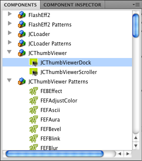
2. Open the Components panel (Window > Components or Ctrl + F7 for Windows/Cmd + F7 for Mac OS) and, from the JCThumbViewer folder, select the JCThumbViewerScroller component. Then drag it and place it on the stage. 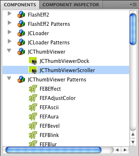
3. Next, using the JCThumbViewer Panel, specify the source XML containing the list of thumbnails and information about the items that will be loaded into the JCThumbViewerScroller component and which of the FlashEff2 Patterns you want to apply for filters or button effects. For this, make sure you have selected the JCThumbViewerScroller Component you just placed on the stage and open the JCThumbViewer Panel (Window > Other panels > JCThumbViewer Panel). Login to your JumpeyeComponents account if so prompted (requires permanent internet connection). 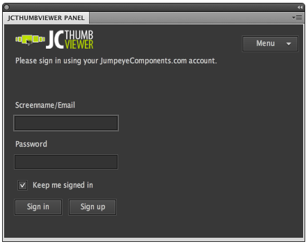
Note: You have to purchase the component in order for the JCThumbViewer Panel to log into your JumpeyeComponents.com account. If you do not have the component in your downloads list of your JumpeyeComponents.com account, a warning message will be displayed. 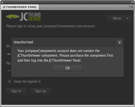
4. If the JCThumbViewerScroller Component object is selected, the JCThumbViewer Panel will display information for that component instance. In the JCThumbViewer Panel, set the source and properties of the component and choose up to three filters you would like to apply for the items. Also, if you wish, you can select a button effect pattern from the corresponding list. The selected filters and button effects will be applied on all of the items in the list. Once you select the pattern you like, the JCThumbViewer Panel will import it automatically into the library. 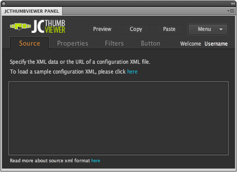
Note: The patterns and presets are displayed as lists of icons. Each icon is actually a preview of the pattern/preset. To see the animation of a pattern or preset, simply roll your mouse over the icon. 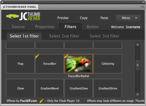
5. Once you choose a FlashEff2 pattern, you may customize it and then test your file by hitting Ctrl + Enter for Windows or Cmd + Enter for Mac OS. 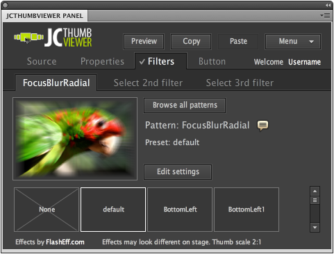
Note: From this point onward, to create multiple scrolling thumbnail lists, you can simply use multiple JCThumbViewerScroller instances in the stage. To do this, drag the JCThumbViewerScroller Component from your library over the stage; then, use the JCThumbViewer Panel to configure them. Note: If you would like to use a single JCThumbViewerScroller instance for your slide shows and continually change the source property to a different XML data you need to use ActionScript 3.0 code (intermediate or advanced Flash/coding skills are required). 4.5. Skinning the JCThumbViewerScrollerThe component has three controls that can be skinned to give it a different look: the play slide button, the pause slide button and the label for the items. Each control has a unique name and can be accessed directly from the component's assets folder in the library. You can simply double click on each control to open them and then edit the contents to fit your needs.The controls are found in the JCTVSSkin Assets folder in the library (created automatically when you drag the component into the library). The label is called JCTVS_Label and is found directly in the JCTVSSkin Assets folder, but the buttons are placed each one into its own folder that also contain the graphical assets of the buttons. The play button is called JCTVS_PlayButton and is located in the Play folder inside the JCTVSSkin Assets folder. The pause button is called JCTVS_PauseButton and is located in the Pause folder, inside the JCTVSSkin Assets folder. 4.5.1. Change font settings for the label1. Open the Library panel and double click on the JCTVS_Label symbol (JCTVS Assets folder) to open it.2. Inside the opened symbol select the text field and change the font settings (font name, color, alignment) to suit your needs. The text in the label is center aligned by default, but for the vertically displayed scroller you might want to align the text to the left to be displayed near the thumbnails. 3. Save the file (Ctrl+S for Windows or Cmd+S on Mac OS) and compile it by hitting Ctrl+Enter on Windows or Cmd+Enter on Mac OS to see the modifications. 4.5.2. Position the label above the thumbnails1. Open the Library panel and double click on the JCTVS_Label symbol (JCTVS Assets folder) to open it.2. Inside the opened symbol select the text field and reposition it (change the y coordinate) so that it would be displayed above the thumbnail. For example, if the thumbnail height (itemHeight property) is set to 100 pixels and the label has a height of 17 pixels, the new y coordinate value should be the current y value (which is 0 by default) minus the item height minus the height of the text field (0 - 100 - 17 = - 117 pixels). 
3. Compile the file by hitting Ctrl+Enter on Windows or Cmd+Enter on Mac OS to see the modifications. 4.5.3. Rotate the play/pause buttons from vertical to horizontal1. Open the Library panel and double click on the JCTVS_PlayButton or JCTVS_PauseButton symbols (JCTVS Assets/play or JCTVS Assets/pause folders) to open them.2. Select the button symbol on the stage and simply rotate it from the default vertical position to the horizontal position (90 degrees rotation). You also have to reposition it so the registration point of the clip is still at the top-left corner of the button. 
3. To see the changes take effect set the direction property of the component to "vertical" (JCThumbViewer Panel > Properties panel) and compile the file by hitting Ctrl+Enter on Windows or Cmd+Enter on Mac OS to see the modifications. 5. JCThumbViewer PatternsJCThumbViewerScroller and JCThumbViewerDock use scripts to generate all kinds of visual effects based upon the user's settings. These scripts are the same scripts used by FlashEff2 and are saved individually within the JCThumbViewer framework as SWC files/components and are called "FlashEff2 Patterns."For a FlashEff2 Pattern to work, it has to be imported into your library (the imported SWC resides in the Flash project library and is not imported as a separate AS file). The JCThumbViewer Panel imports the pattern automatically after you select it in the corresponding tab (filters or buttons). 5.1. FlashEff2 Pattern TypesThere are currently 2 types of FlashEff2 Patterns used, that may be grouped into 2 main types based upon the effects they enable: filters (filter patterns) and button effects (button patterns).5.1.1. Filter Patterns (prefix: FEF)FEF patterns are used for applying overall filters to the items of the JCThumbViewer components. Additionally, you may add multiple filters (up to three filters) and change the order in which they are applied over the JCThumbViewer items.Note: Some filters will not work correctly with the component's scaleMode property set to scaleCrop and scale unless their refresh property is set to false (unchecked). 5.1.2. Button Patterns (prefix: FEB)FEB patterns are used for turning any instance of a DisplayObject (e.g., MovieClip, Sprite, Dynamic TextField), in this case the items of the JCThumbViewer components, into an interactive button.There is only one button pattern that allows you to apply different button states to your target clip. You may also customize each effect for any button state separately. All the button states have the same customizable settings: alpha transparency, rotation, changing x/y coordinates, changing the scaling values, blur filter, glow filter, color matrix filter, bevel filter, drop shadow filter and tint. The button will go through the state effects using tween animations, which you may customize in the Tween tab, separately for each button state. You may have different values of the effects for each separate state, or you may choose to apply some of the effects on one state and other effects on another state. 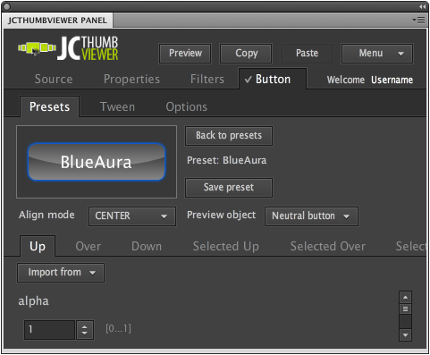
5.2. Choosing a FlashEff2 PatternThe FlashEff2 Patterns are grouped together based upon the type of actions they produce (filters and buttons). Depending upon the type of effect you want to apply, select one of the Filters or Button tabs. Each tab contains another set of tabs used for selecting and customizing the effects.The Select 1st filter, Select 2nd filter and Select 3rd filter tabs contains the list of all the filter patterns. The patterns in the lists are displayed as icons, which are actually previews of the effects. Rolling your mouse over the respective icons activates the previews. To choose a FlashEff2 pattern for the currently selected JCThumbViewerScroller Component, simply click it. This will open up the presets list for that pattern. 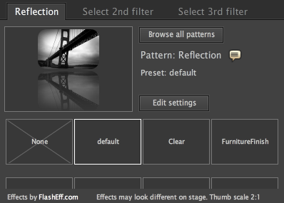
Once a preset has been selected or the effect parameters have been set the current effect may then be previewed in the top-left viewing pane of the tab.
5.3. How FlashEff2 Patterns Work TogetherThe selected patterns (filters and buttons) will be applied exactly the same on every item of the JCThumbViewer components. Depending on the Draw after filters setting (JCThumbViewer Panel > Button tab > Options tab), the button effects can be applied before the filter patterns (if the option is NOT checked) or may be applied after the filters (if the option is checked).Important! Due to individual characteristics of each pattern, we do not recommend the use of more than one type of pattern on the same JCThumbViewerScroller item. However, the component allows this to occur, because in most cases blending different types of patterns on the same item actually works (i.e., the JCThumbViewer Panel allows you to apply a maximum of 3 filters on the same item). 6. Using the JCThumbViewer Panel6.1. Applying FlashEff2 PatternsThe easiest and most common way to apply filters and button effects on the JCThumbViewerScroller items is by using the JCThumbViewer Panel. From the panel you may select any pattern you want to apply to your JCThumbViewerScroller instance, easily customize it, and preview the result of your pattern configuration.1. First, either select a JCThumbViewerScroller Component instance from the stage or drag an instance of the JCThumbViewerScroller Component to the stage and leave it selected. 2. Open the JCThumbViewer Panel (Window > Other Panels > JCThumbViewer Panel or Ctrl + F7 for Windows/Cmd + F7 for Mac OS). If prompted, log in with your JumpeyeComponents.com account username and password. 3. Make sure the JCThumbViewerScroller Component is selected on the stage. In the JCThumbViewer Panel, select the type of effect you want to apply (filters or buttons) from the appropriate tab. 4. The selected pattern has a number of existing presets from which you may choose. 5. To customize the selected pattern further, you may change the property values in the Edit Settings section of that. 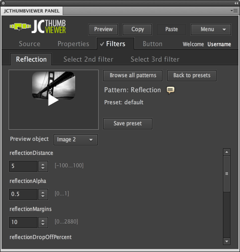
6. For each selected animation or filter, the FlashEff2 Pattern is automatically imported into the library. Note: After experimenting with more patterns, you will notice they have all been imported into your project library. If you want to get rid of the unused patterns, choose Menu > Optimize fla. If you accidentally remove patterns from the library and youre not sure which patterns they were, you may use the Menu > Update fla option to let the JCThumbViewer Panel scan your project. It will import the patterns that have been applied but are not found in the library. Important! These operations are time consuming and use a lot of CPU power depending upon the number of JCThumbViewerScroller Component instances in your .fla file. Also, depending on the amount of JCThumbViewerScroller instances you've created, these operations may not import all the missing patterns or may not remove all the extra patterns, so it is always a good idea to check all the FlashEff2 patterns you used. 6.2. Previewing Your WorkThe patterns and presets are displayed as lists of icons. Each icon is actually a preview of the pattern/preset. To view the button animation (up, over or down) of a button preset or the effect of a filter, simply roll your mouse over the icon to see the example effect.To preview your selected pattern, along with any customization you may have made, each preset type has a preview pane area in the top-left corner of the corresponding tab. 1. Filter tab: The preview always has the filters applied. 2. Button tab: Preview the button effect by clicking and rolling the mouse over and out of the button sample provided in the preview pane. By selecting the Preview button on the top of the panel, you may preview the entire effect applied on the target object (the button effects along with all the applied filters). 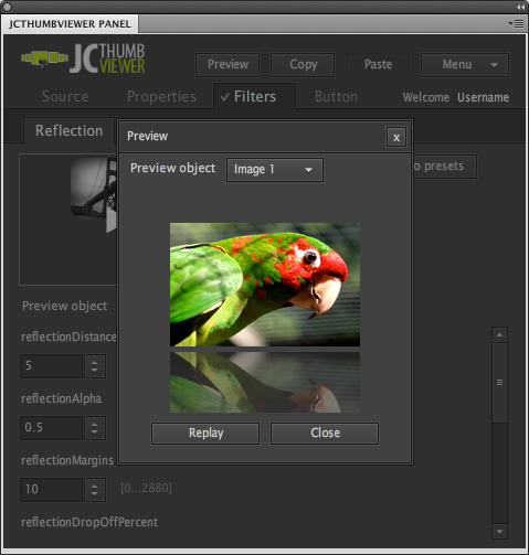
6.3. Filters1. In the JCThumbViewer Panel select the Filters tab (remember that a JCThumbViewerScroller Component instance from the stage must be selected first) and you may select up to three filter patterns.Select the first sub-tab. When the filter tabs do not have a filter preset selected they will have the names "Select 1st filter", "Select 2nd filter" and "Select 3rd filter". Tabs that already contain a filter will display the name of the selected filter preset. 2. From the filter presets list, select a desired filter (to preview an effect, roll your mouse over the preset). 3. To remove a filter from the JCThumbViewerScroller Component instance, deselect the preset from the presets list; return to the presets list and select the item None from that list. 6.4. Buttons1. In the JCThumbViewer Panel select the Button tab (remember that a JCThumbViewerScroller Component instance from the stage must be selected first).2. On the Presets tab you'll find a list of presets for the button. You may select one of the presets to apply the effect on the target object. 3. To remove a button effect from the target object, simply open the list of presets and select the item None from that list. 6.5. Customizing and Saving EffectsOnce you select a pattern and the list of presets opens, you may choose a preset from the list. A preset is a pre-configured effect. The JCThumbViewer Panel allows you to further customize the pattern by setting each of the pattern parameters as you wish.Once youve finished tweaking the pattern settings, you may save those settings as your own custom preset. Click on the Save preset button, give it a name in the opening dialog, and click the OK button. The next time you select the same pattern and the presets list appears, your preset will be among the existing ones. 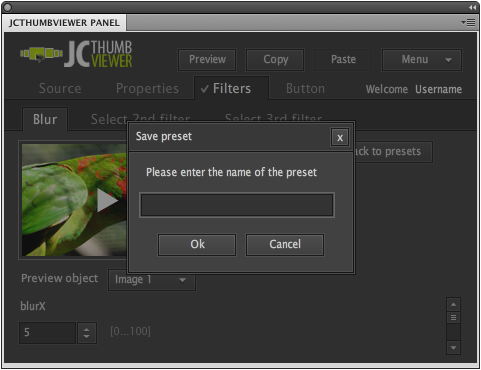
Other settings may be done in the Tween tab, available for the Button effects. Here you can set the type of tween the effect will have and the duration of the effect for each of the button states. 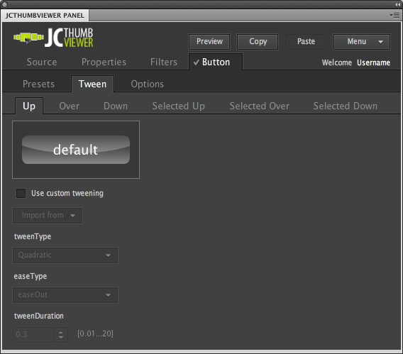
6.6. Using the Same JCThumbViewerScroller Settings Over Multiple InstancesIn case you need multiple instance of the JCThumbViewerScroller component but you would like to use the same settings for all of the JCThumbViewerScroller instances then you don't have to make the settings all over again, for each instance of the component. You can simply use the JCThumbViewer Panel to make the necessary settings for one JCThumbViewerScroller instance, use the Copy button to copy the settings to the clipboard (in the form of XML data) and then use the Paste button in the JCThumbViewer Panel, for the rest of the component instances:1. Select one of the JCThumbViewerScroller instances on the stage and bring up the JCThumbViewer Panel to make the necessary effect settings (Window > Other Panels > JCThumbViewer Panel). 2. Once you set up the selected JCThumbViewerScroller instance, press the Copy button to copy the settings to the clipboard. 3. Next, select any of the other JCThumbViewerScroller instances and in the JCThumbViewer Panel use the Paste button to copy the effect settings. You will be prompted to confirm which of the FlashEff2 patterns you want to apply, in case you have set up multiple patterns (several filters and the button effect). Note: With this operation, you can copy the filter and/or button patterns used by one of the JCThumbViewerScroller instances together with the rest of the properties, except the source property. For each of the JCThumbViewerScroller component instance you placed on the stage, you'll have to manually set the source property. Table of contents
1. OverviewJCThumbViewerDock is an Adobe Flash CS4 ActionScript 3.0 component created by JumpeyeComponents to provide an easy way for displaying thumbnail lists as thumbnail pages and navigating through them. Further more, the component supports FlashEff2 filters and button effects applied over the items in the list.JCThumbViewerDock is part of a larger package, JCThumbViewer, which contains another similar component, JCThumbViewerScroller, for displaying thumbnails in a scrolling list. Both components can be easily set up using the JCThumbViewer Panel in a similar way to the FlashEff2 component. Note: JCThumbViewerDock is only working with Flash Player 10+ and Adobe Flash Professional CS4 and this is why it will not appear in the Components panel of Adobe Flash CS3. Note: For information on the properties, methods, events and the XML structure required to set up JCThumbViewerDock, please consult the ActionScript 3.0 Usage document. Note: For best results make sure the itemWidth and itemHeight values match the actual thumbnail image width and height in pixels and use the "exactFit" scale mode. 2. CompatibilityActionScript: 3.0Flash IDE: Flash CS4 (ONLY) FlashPlayer: FlashPlayer 10 + 3. Requirements1. JCThumbViewerDock runs in CS4, AS3.0 only, on both Windows and Mac.2. A permanent Internet connection and a JumpeyeComponents.com account are required to run the JCThumbViewer Panel. 3. No coding skills are required (while using the JCThumbViewer Panel for configuring the component) unless you would like to use it in advanced/script mode; however, basic Flash CS4 knowledge is necessary. 4. Installation and Usage
JCThumbViewerDock consists of two parts: the Component itself and the components interface panel. The JCThumbViewerDock Component (Window > Components) is the main part of the JCThumbViewerDock system. It is the element that holds basic actions, and it controls and mediates between different objects and the FlashEff2 Patterns based upon the settings received from XML statements or directly from the JCThumbViewer Panel.
|
Overview | Properties | Methods | Events | XML | ActionScript 3.0 usage | User Manual


